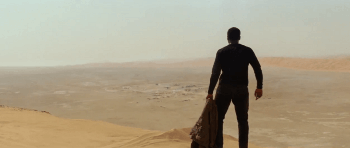
With the long awaited Star Wars movie finally upon us, I wanted to post something about the impressive design elements that have always been strong with the force in these movies.
I recently read an outstanding article perfectly notating each and every delicious design principle used in the original movies. And, much like how JJ Abrams had the good sense to film this latest installment in the style of the originals instead of the prequels, many of these design principles maintain their obvious presence in Star Wars: The Force Awakens.
The two main design principles I want to discuss are the use of SCALE & CONTRAST. They are the most obvious throughout and best used to support the story although DEPTH occupies much of the beginning scenes.
When a designer begins a project, one of the first things we do is to create the narrative, sometimes on our own and many times by the client’s instruction (i.e. a corporate brand or a family history); it just depends on the type of project. We then develop the story by making selections that support that story. You see it throughout The Force Awakens with the use of scale. A deeper understanding of the momentous occurrence in Star Wars history cannot be avoided when you see these images.


The use of scale is undeniable and extremely effective in showing you the history and a bit of foreshadowing as well.
This review really does a good job with touching on some design elements and also, it’s just a damn good review of the movie plus the author does claim no spoilers so go on and enjoy if you haven’t seen the movie yet.
Some other examples showing the use of design principals in The Force Awakens are:


CONTRAST, REPETITION & POSSIBLY AN ARGUMENT FOR ASYMMETRY

We cannot talk about design and Star Wars without mentioning the ever present & dramatic use of light. Light is always an important factor in design and it’s the central issue in the Star Wars story. The way light is used throughout the movie helps to unfailingly support the struggle between the Empire and the Resistance or the Dark side and the Light.
To finalize the narrative of a project with all our selections and designs, we organize them in a way that makes sense and allows the viewer and inhabitant to experience or participate in the story. Star Wars: The Force Awakens did a great job maintaining the design style associated with the first 3 released films: Star Wars (A New Hope) (1977), The Empire Strikes Back (1980), and Return of the Jedi (1983) and while one can argue the storyline-chronological thing until the end of time, this new film is a design delight with all the original elements still intact.
-Staci
For all your design needs call 856.269.0707 or email us at [email protected]

